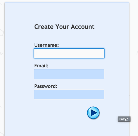
Are you ready to see just how far you can take your Lectora® e-Learning course? We asked a pro Lectora developer, Tim Kindberg, to share some insight into using CSS to style a Lectora course. Check it out:
There are a lot of things that Lectora does for us. However, in the occasional instance where we want something a bit more, Lectora is also great at allowing us to use our additional skillsets to add some extra flair. Some people like to use their Photoshop chops to spice up a course, others like to use their video production talents, but I'm a code monkey, so I want to "Do It With Code!"
CSS isn't exactly the most advanced programming language, but it's the best tool for the job when it comes to styling lots of elements quickly.
Some examples of things the Lectora team has used CSS for are:
- Bullet styling
- Cropping/masking content
- Rounding corners on images, text boxes, etc.
- Adding shadows to boxes or panels
- Removing or modifying the default frame style of a web window
- Removing or modifying default styles on Dialog boxes and Lightbox popups
- Modifying the margins for wraparound text to give it more or less space between elements
- Modifying the hit areas of checkboxes and radio buttons (these hit areas are visible on iPads when you touch the button, and they don’t always fit nicely)
- Animating CSS styles to move from one value to another
I've whipped up an example for you to check out. It's basically a form where I've styled the input fields to follow modern styles. When you focus a field, it does a cool animation to a focused state using CSS transitions.

I've also added some shadow to the main light blue panel, as well as made it fit the full height of the browser. You can see this by resizing your browser height and watching the panel's bottom edge. I was able to achieve this by adding a “centerpane” class to the background panel and modifying it with CSS. I also had to adjust the main page element, which is called #pageDIV.
Lastly, when you hit the submit button on the bottom—I used one of Lectora’s awesome Theme Stock Buttons—it will check the username and password field for valid inputs. If they are empty or have invalid characters, such as “!#$,” or in the case of the username field if it is missing an “@” or a period, then I add a class of “error” to those elements. The “error” class has a bold red style to indicate the error state to the user.
To dynamically add and remove classes, I did have to add some custom JavaScript. I then used some Run JavaScript actions that used my "addClass" and "removeClass" functions.
Thanks for sharing your Lectora and CSS coding knowledge with us, Tim!


