
There’s a lot to consider when choosing a font for your eLearning content. There are so many fonts out there! A good rule of thumb is to choose 5 or 6 go-to type families for all your projects. This gives your work a distinctive style and consistent feel.
What makes a good font?
Weight
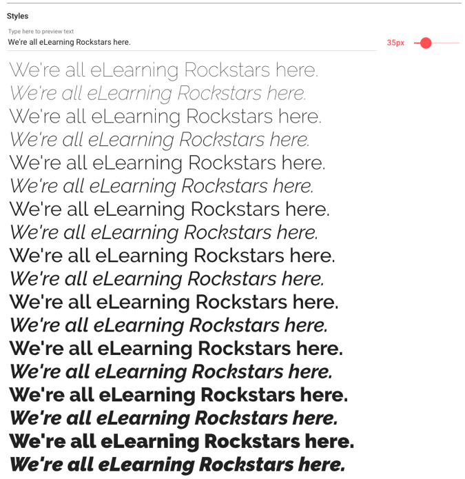
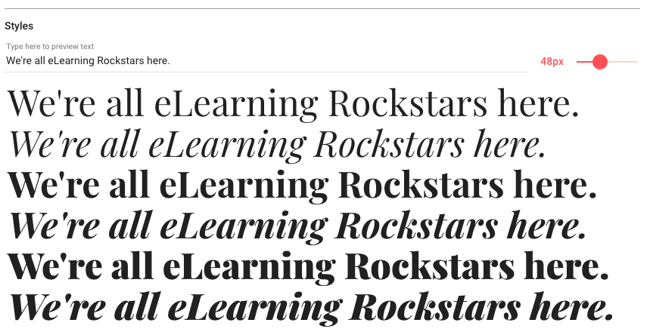
Many fancy/fun fonts are only available in one weight, which limits how you can style and display text in your projects. Look for a typeface family that includes multiple weights and styles—it will add flexibility and variety to your projects while maintaining consistency. That’s huge if you want to declare a standard font to be used across multiple course templates and layouts.
Print vs Web
Web fonts are specifically designed for easier on-screen reading, especially on a mobile device. Generally, web fonts are sans serif. (Learn about serif vs. sans serif fonts in this webinar.) However, as screen qualities get better and better, you can get away with serif fonts on the web more. In fact, a serif font can be a great choice if you’re trying to evoke a nostalgic vibe or make your design look more editorial. For example, the Courier font was designed to resemble old typewriter memos.
Print fonts were designed for—you guessed it—printed materials. These are often heavier in weight, with more curves and wider spacing. The natural characteristics of print fonts can make them harder to read on screens. Fun aside, I recently watched an interesting video about the creation of a more sustainable print font, Ryman Eco. It uses 33% less ink than a suite of standard fonts, helping reduce ink packaging waste.
Where to get fonts?
Google Fonts is a great resource for free, open-source typefaces. Here are 5 great choices:
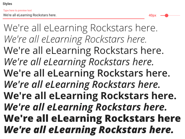
Open Sans
Open Sans was designed by Steve Matteson and comes in 10 different styles, from light to extra bold. We use this one in some of our template styles.
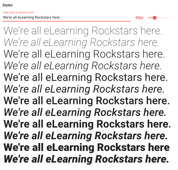
Roboto
Roboto was designed by Christian Robertson and is the official font family of the Android operating system. Roboto comes in 12 styles with weights ranging from thin to ultra-bold. The font gives off very modern vibes and is sort of a mashup of popular classic fonts Helvetica, Arial, and Univers.
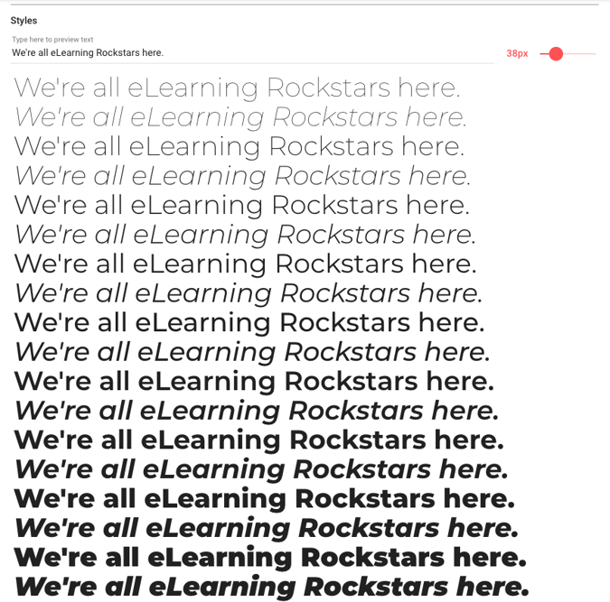
Montserrat
Julieta Ulanovsky designed this typeface inspired by the old posters and signs in the traditional Montserrat neighborhood of Buenos Aires. It comes in 18 styles.
Raleway
This is always a popular choice. Raleway was originally designed for headings and other large type situations but was expanded to have more weights and styles in 2012.
Playfair Display
I had to throw in one serif font! Playfair is generally used for headlines and other display text, but it pairs well with Georgia for body text. With only 6 styles it is more limited than the others I’ve listed, but it makes for such lovely display text.
Many people asked about font pairing in our recent typography webinar. One thing I like about Google fonts is that if you go to each font’s detail page, you’ll find a list of popular pairings with that font. We’ve also pinned some font pairing inspiration to our eLearning Graphic Design Pinterest board for you.


