One of the most exciting new features of Lectora® 16.1 is the new Test Results Object with Results Designer. Prior to Lectora 16.1, you could check the Use Customized Test Results checkbox on the Test Results ribbon and get an automatically generated page within your test that showed the test results.
But any kind of customization you may have wanted to apply to that page was pretty limited. Also, you could not use the Customized Test Results option with responsive titles or save them as library objects. With the new Test Results Object and Results Designer, you can now choose what data to show, the order in which the data is presented, modify all of the text properties, and even add images within your results. You can also add additional items to the page, such as text boxes, images, or buttons, as you would to any other page in your title. Plus, the results are now fully compatible with responsive courses and can be saved as reusable library objects! Let’s have a look.
The option to Show Test Results is in the same place it has always been on the Results ribbon for Test objects. And there is no longer a separate option for “Customized Test Results.” All results are now the same, and all are customizable.
Test Results Ribbon

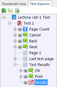
Once you check the Show Test Results checkbox, a Test Results page is added as the last page within the Test, and Lectora will automatically select the Results object on the Test Results page and switch to its Properties ribbon.
Results Object in Title Explorer
Results Object Properties Ribbon
The Results object is a special kind of object. On its Properties ribbon, you can choose which type of Questions to show in the results—Correct Questions, Incorrect Questions, and Unanswered Questions. The Results Properties ribbon is also where you can access the Results Designer.
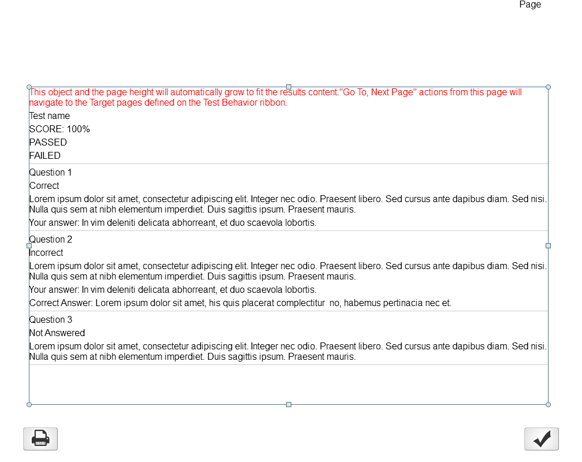
Once the Test Results page and Results object are created, you can immediately preview the page to see what your results will look like in all 5 responsive views with the current Results Designer settings. “Lorem Ipsum” placeholder text is provided to give a more realistic preview.
Default Test Results Page With Results Object
The red text at the top of the Results object informs you that the page height and the Results object itself will grow to fit the actual results content at runtime. This means that it won’t matter how many questions are in your test, and also that any Go To, Next Page actions called from the Test Results page will navigate to the Target pages defined on the Test Behavior ribbon. This red text will NOT appear in your results at runtime.
You can place and resize the Results object independently in each responsive view. Print and OK buttons are automatically included on the Test Results page as well. You can use these default buttons, modify them, or remove them as you wish. You can also place other objects, such as images or text, on the page. But if you place the objects below the Results object, be sure to check the Offset from Bottom option on that object’s Position & Size ribbon. This will ensure that the objects stay below the Results object when the page grows vertically at runtime.
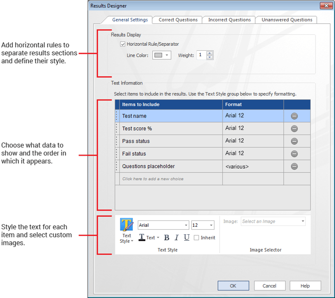
Now let’s look at the Results Designer. Click the Results Designer button on the Results Properties ribbon to open it. The General Settings tab is active when you open the Results Designer.
General Settings Tab of Results Designer With Default Options
The General Settings tab is where you define the basic data items to appear in the test results and the style of those items. The image above shows the default options, but there are several more data items to choose from. The options include:
- Correct-over-total count
- Custom image
- Fail status
- Lowest passing score
- Pass status
- Questions placeholder
- Student name
- Test name
- Test score %
Clicking on each of the items in the Items to Include column opens a drop-down menu where you can choose any of the items in this list. You can also reorder the items by clicking and dragging the dotted boxes on the left.
For text items, the default font and style will be inherited from the Test Results page. However, each item can be uniquely customized. When you first open the Results Designer, the Inherit checkbox in the Text Style control section is checked by default. To modify the styles of the text items, select each individual item and uncheck the Inherit checkbox to enable the style controls. Then apply your desired styling.
To add an image, click on the row that says, “Click here to add a new choice” and select Custom image from the drop-down menu. Then select the image you want to include from the Image menu in the Image Selector section.
Note: The image must already be at the desired size. You cannot change the size in the Results Designer.
The Questions placeholder is a special item that is included when you choose to show Correct Questions, Incorrect Questions, or Unanswered Questions. This is just a placeholder to indicate where in the order of items you would like the question data to appear. You cannot apply text styles directly to this item. Instead, you will apply text styling for question data on the Correct Questions, Incorrect Questions, or Unanswered Questions tabs.
Note: If you remove the Questions placeholder, no individual question information will appear in the results.
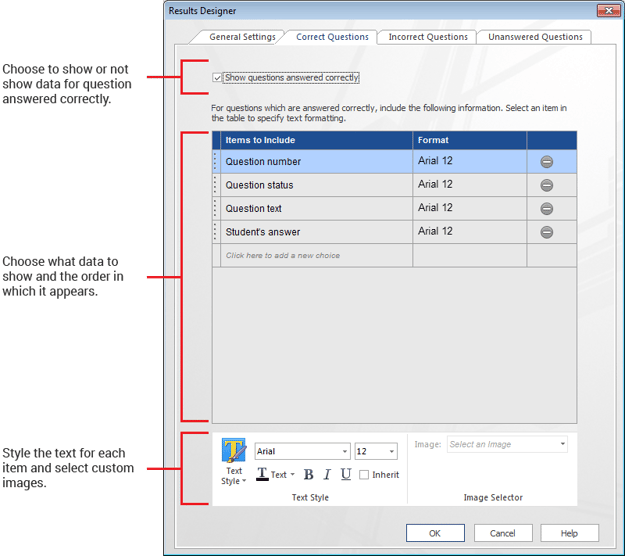
Correct Questions Tab of Results Designer With Default Options
The Correct Questions, Incorrect Questions, and Unanswered Questions tabs are very similar. These tabs are where you define the data items for each type of question and the style of those items. The image above shows the default options for Correct Questions, but each question type has more options than are show here. The options include:
- Answer choices
- Correct answer
- Custom image
- Display message feedback
- Link to first page in test
- Link to question in test
- Question name
- Question number
- Question status
- Question text
- Student’s answer
There are 11 data options. However, Correct answer does not appear in the Correct Questions options, and Student’s answer does not appear in the Unanswered Questions options for obvious reasons.
Once you have made all of your styling and data options choices, click OK to apply. You will instantly see a preview of what your results will look like in the Results object on the Test Results page.
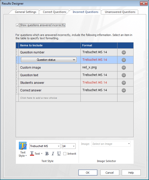
Incorrect Questions Tab of Results Designer With Custom Options
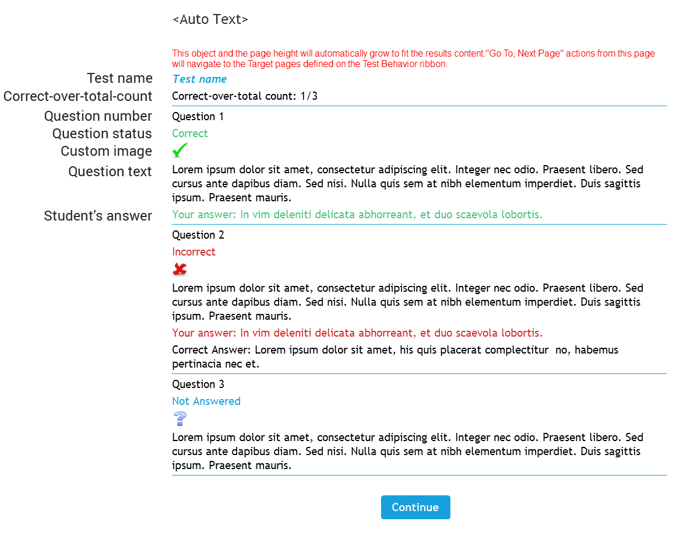
In the image above, the font for all of the text items (Trebuchet, size 14, black) has been inherited, except for 2 items where it has been changed to red. You will also notice that a custom image has been added after the Question Status text. All of these items will appear in a single column in the results. Here is an example of the results with full customization.
Customized Test Results Preview
Now it’s your turn! Give the new Lectora 16.1 Customized Test Results a try today! If you don’t already have Lectora desktop, sign up for a free 30-day trial. Customized results coming to Lectora Online soon.
