As a graphic and visual designer by trade, I have had my hands on projects in many fields. As such, I've used and seen many techniques for creating final design deliverables. There are the design sins that you were told by your college professor to absolutely never do (like using the typeface Papyrus for anything other than a joke—you will be disowned), and then there are the techniques that (hopefully) are innately part of your creative core. These are design basics we use every single day so many times that we may not even consciously realize we’re doing it.
I would like to explain four tips that any designer, newbie or pro, can—and should—be using in every design project. These tips cover contrast, repetition, margins, and alignment. Whether your project is an eLearning course, web banner ad, product catalog, or poster, all of these principles and tips apply. Always.
Contrast
Contrast—a key principle of design—is more than just large versus small or black versus white. It can refer to and be used in many ways, such as the contrast of:
- text on a background color
- typefaces: serif vs. sans serif)
- type weight: e.g., BOLD vs. Light Italic
- color value/hue
- scale
- shapes
- Images
- patterns/textures, other various design elements
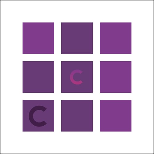
No matter what type of contrast you're using, the goal is to help organize your design, establish a hierarchy (create emphasis), and keep the viewer visually engaged. A design where everything is the same size, shape, or color is going to be excruciatingly boring—yes, excruciatingly!
Example of poor contrast:
Example of better contrast:
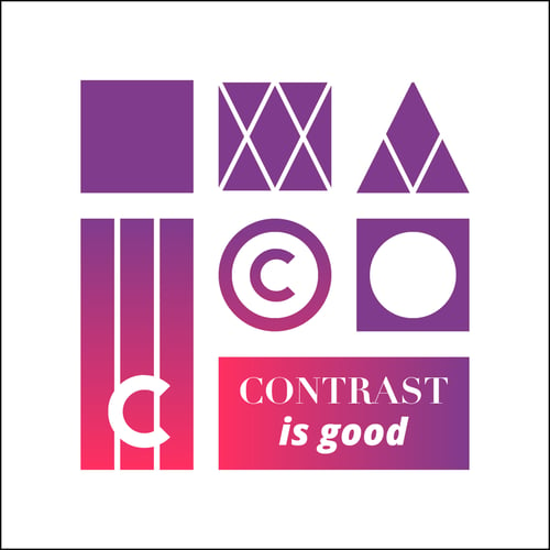
On the contrary (we’re contrasting right now too!), too much contrast can be just as bad as none at all. Your design can get very confusing and viewers can feel like their eyes are being assaulted. Also, if everything is contrasting nothing will stand out. Duh.
So what’s the quick trick to becoming a "master contraster?" Sorry to say, but there is none. Practice, practice, practice will only increase your already-amazing design skills. You can also look at other artists’ designs and really study them to see how they use contrast in their work.
Repetition
Repetition is reusing same or similar elements throughout your design. For example, if I were to build out an eLearning or training course that had multiple slides and interactions, I would want to reuse things like color, typefaces (even the size of type), background patterns/textures, and other design elements that can be repeated.
Repetition brings a clear sense of consistency, cohesiveness, and unity; but, like most things, you don’t want to overdo it.
Are these words sounding familiar when you were asked to build a brand for yourself or a client? On a much larger scale, consistent use of repeating elements helps create a corporation's brand and plays a huge part in a consumer’s trust with that company.
In these examples for one campaign, we can see repeated type, color, and shapes (the triangle pattern and angular shapes repeated in the logo and background elements, as well as the colored splats):


Margins
All I have to say here is “know what your margins are and USE USE USE them!”
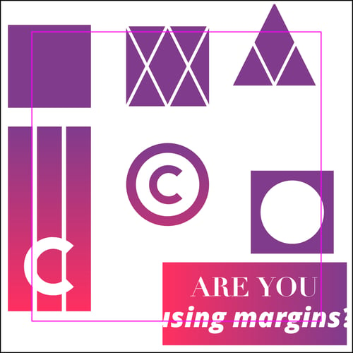
JK, I definitely have more to say about this. Improper use of margins drives me absolutely nuts, and I feel like it should for you too. Giving your content enough room to “breathe” is so very important. Margins help give your project white space so the viewers’ eyes have a place to rest, keeps a clean and balanced design, and helps make it feel not so claustrophobic.
Margins should also always be considered when placing text in a colored box or over an image. The same principles apply—make sure there is plenty of space around your content. It will make it easier to read and feel proportioned correctly.
Example of improper use of margins:
Example of proper use of margins:
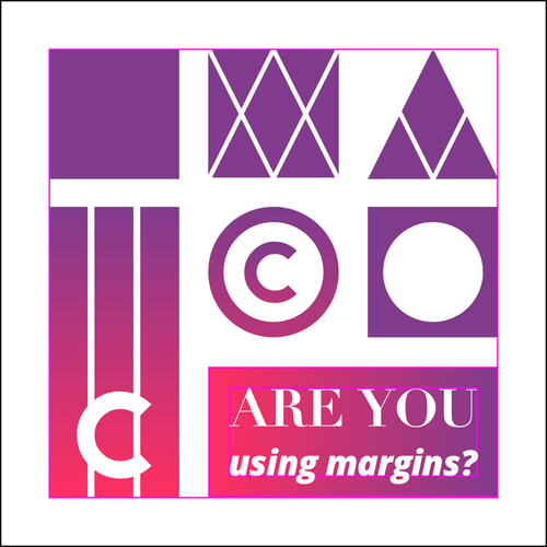
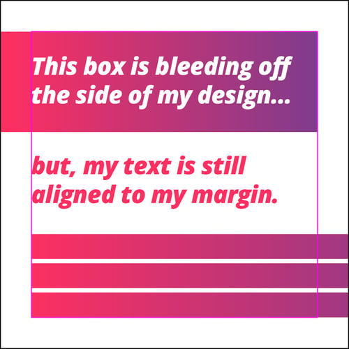
There is, as always, the exception to the “rules”—like having text, images, or design elements bleed off your stage/artboard. However, just make sure you are conscious of what you’re doing and that you're doing it with purpose. Otherwise, it will look like you don’t know what you’re doing. And no one wants that.
Example of elements bleeding off the page that still use proper margins:
Alignment
You wouldn’t think this would be something we need to talk about, right? Welp, we do. Sometimes we just don’t make the conscious decision to look at how things are aligned—and that’s bad. Ohhhhh, so bad. Start by looking at objects and elements next to your margins. Are they lined up, pushed next to, and flush with your margin? Well, for Pete’s sake, why not!?
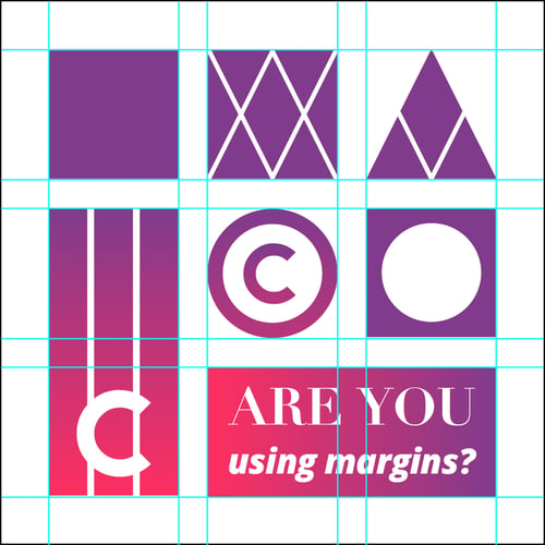
Margins don’t only apply to the outermost part of your file. Making sure there is proper, even space between columns and rows of inside content matters just as much. Make sure to align all your content and visual elements in a column or row together. When done correctly, this is very pleasing to the eye and creates an implied line for the viewer to follow easily.
Example of using and aligning objects in columns and rows:
Phew. That was a lot. But you got it all, right? Of course you did, you're a rockstar. Go forth and create amazing designs, young grasshopper.
Check out our other graphic design resources, tips, and tricks on the blog. Then sign up for a free Template Library account to practice your new skills!


