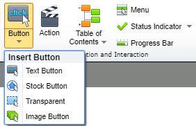
Buttons allow users to execute actions, like navigating within a title, launching Web pages, showing hidden objects, launching programs or documents, and displaying messages. There are four types of buttons available in Lectora and Lectora Online: Text Button, Stock Button, Transparent, and Image Button.
The process of using buttons in a title entails five steps (two of which are optional but recommended):
- create the button
- position and size the button on the page
- configure the buttons properties (optional)
- configure the button’s style (optional)
- configure the button's action
Create the Button
To add a button into Lectora or Lectora Online navigate to the Insert ribbon. From the Add Navigation and Interaction section, select the Button drop-down.

From here you can choose between four button types.
Text Button: This option allows you to create a button using a basic shape which includes text on the inside. Text can be omitted if desired.
Stock Button: The Media Library contains several stock buttons in a variety of colors and styles that you can add to your title. These include standard buttons such as Home, Previous, and Next buttons that can be used for traditional navigation purposes. Other button types are also available. Open the Online Media folder at the base level of the Media Library to unlock dozens of free buttons being shared online with fellow Lectora/Lectora Online users.
Transparent: Transparent buttons are buttons which will be rendered invisible upon preview or publish. Transparent buttons are useful for layering on top of images and text to turn portions of the image or text into hot spots.
Image Button: If you’re looking to create a custom button you can upload your own images to be converted into a button by including a Normal, Over, Down, and Disabled version of the button images.
Position and Size
Once the button has been placed in your course you may wish to adjust the size and/or location. You can do this by either navigating to the button’s Size and Position contextual ribbon and adjusting the height and weight or x and y (respectively) or using the adorners/handles provided within the canvas. You can also turn on the ability to maintain the ratio and enable rotation and mirroring.

Configure Button Properties
From the button’s contextual ribbons you can navigate to the button’s Properties. From here you can rename the button, change the appearance, apply a transition, turn on web options, or add an action. It’s always recommended that you rename the button so you can easily locate it within your Title Explorer. If the button should not be seen by the user when the page is first loaded select the Initially Hidden option. You can also set the button to Initially Disabled if the button should not be selected right away. You can then add additional functionality as to when the button should become enabled.

Configure Button Style
From the button’s contextual ribbons you can navigate to the button’s Style. From here you can change the shape, shape style, add effects, change the text style, and change the states of a button.

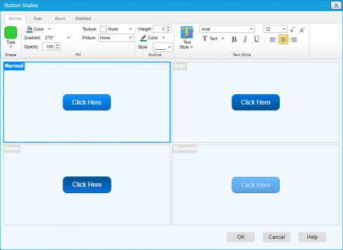
The button states refer to the four ways a button may be viewed when published.
Normal: as the button exists when the page is displayed
Down: when the button is clicked
Over: when the users pass their cursors over the button
Disabled: when the button has been made inactive
You can customize these states within the Button States window by selecting the state. Then make changes to it from the Shape, Shape Style, Effects, and Text Style sections. In order to adjust a button, you may need to move the Style from Auto to Custom in order to enable the other sections.

Configure Button Action
A button is an interactive object and can be assigned actions that occur when a user clicks the button. All buttons come with an action included for you to configure. Buttons added (especially from the Stock Button category) may already have a valid action. For example, buttons named Next will have an action that automatically moves the learner to the next page. Either way, you should check or edit the action in order for the object to become an active element of your eLearning.
To assign an action to a button, select the button’s Action ribbon and complete the following steps:
Trigger: By default, for buttons, the trigger is set to Mouse Click. That is, the action will occur when a user clicks the button with his/her mouse, tabs to and selects the button with a keyboard, or taps the button on a touchscreen
Action: The Action specifies what should happen when the trigger occurs, such as display a message or open an attachment.
Target: Depending on the action selected, a corresponding target may be needed. For example, if the action Go To is selected, a target chapter, section, or page must also be selected, indicating where the user will be navigated when the button is clicked.


