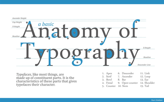
In college, I had to take an entire semester of Typography. That’s right—in the realm of higher education, there exists a semester-long, 400-level course all about typefaces.
Spoiler alert: If you’re trying to tell the difference between Arial and Helvetica, look at the differences of the uppercase G or the lowercase t. Or you can take a look at the helpful graphic I’ve mocked up here with the help of Buzzfeed’s extremely informative Cats as Fonts article.

Because I love our Lectora® users, I’m going to spare you the labor-intensive, meticulously kerned homework projects and give you the highlights right here.
Typography’s Golden Rule: Never use Comic Sans.
Unless you’re actually writing a comic.
Okay, I think that’s all you need to know. Blog over. Just kidding! Let’s get to the good stuff.

6 Common Typography Terms to Know
Serif vs. sans serif
Here’s a boring definition of a serif: a slight projection finishing off a stroke of a letter in certain typefaces.A more interesting way to think of them, courtesy of Purdue University’s Online Writing Lab, is to picture serifs as feet. Since “sans” comes from the French for “without,” you can see fonts as having feet or being without feet.
Which is better? Controversy swirls around this debate. I personally prefer a nice serif font—they’re classy and I like classy things—but my fellow Lectora writer swears by Helvetica—one of the most popular sans serif fonts.
- Research has found that there isn’t much difference in the readability of serif vs. sans serif fonts in print materials. However, in electronic or virtual contexts—aka e-Learning!—sans serif is usually easier to read.
- It’s a good rule to never mix two different serif fonts or two different sans serif fonts. In other words, do not use a Times New Roman title over a text block of Palatino. Both are serif fonts and will not mix well. The ideal combo would be one serif font with one sans serif font.
Tracking
Tracking is the amount of space between letters in a complete word or sentence. It's more of a computer term that is traditionally known as letter-spacing. It’s often confused with kerning, which we’ll get to next.
Kerning
Kerning describes the act of adjusting the space between characters (including those between the words) to create a harmonious pairing. For example, where an uppercase 'A' meets an uppercase 'V', their diagonal strokes are usually kerned so that the top left of the 'V' sits above the bottom right of the 'A'.
The amount of kerning can vary in between different letters in one word, but tracking is applied evenly.
Confused? You can practice your kerning skills with The Kerning Game. That’s right—there are typography games! I know; I just blew your mind.
Leading
Thought we were done talking about spacing? Nope! Leading describes the vertical space between each line of type. The term derives from the days when strips of lead were used to separate lines of type in the days of metal typesetting.
- For legible body text that's comfortable to read, a general guideline is that your leading value should be greater than the font size, usually anywhere from 1.25 to 1.5 times.
Baseline grid
This has nothing to do with sports—sorry! In typography, the baseline is the line upon which most letters sit and below which descenders (such as the lower loop of a 'g') extend. The baseline grid is your friend; it helps you align your text so that it flows smoothly. The baseline grid ensures your text has the correct leading and is vital in any layout that uses columns.
X-height
In every typeface, the height of each character is based on the height of the lowercase x. This is known as each character’s x-height. The ascenders and descenders follow from there. If you’re pairing typefaces—for example using a different face to draw attention to one thing—it’s a good idea to pick two that share a similar x-height.


