Before I developed a huge passion for presentations and visual communications, I worked as an instructional designer for telecommunications courseware. We had to work with SMEs, usually engineers, to pick their brains to help them structure and put on paper all the knowledge required by technicians in the field. That was not always an easy task, but luckily, we could rely on various processes to help us.
When I started my business as a presentation professional, I realized that designing and developing effective, impactful, and impressive PowerPoint presentations was easier when I applied basics I had used in instructional design. Doing so may take some more time at the beginning, but in the end, it made me save a LOT of development time!
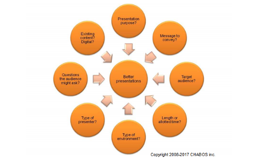
So here is my list of 8 essential questions, or as I also call it, my wheel to better presentations.

1. What’s the presentation purpose?
In other words, what goal are you pursuing with your presentation?
Training? If you are training a group of people on how to give better online support to your customers, you can start thinking about actuals problems or complaints you have and what type of information could bridge that gap.
Information? Your boss might be asking to have a status report on a specific project. That means you will need to gather important details, such as budget used, project delayed or on time, or any specific roadblocks you had or are expecting.
Selling? If you are expected to sell the company products or services to new customers, you will need relevant information about them, such as what problem they solve, how do they compare to competition, or what added value they have.
2. What message do you want to convey?
Whatever the type of presentation you are doing, start with the end in mind! If you decide what is your core message right from the start, or what are the key elements of your talk, it will make it easier to chose every piece of content required to help people understand and remember your message. This question is usually the one I come back to the most to decide between “need to have” and “nice to know.”
This question will help you start outlining what elements you should discuss in your presentation. Put everything on paper, cue cards, or Post-Its first, so you are not tempted to think about “how it will look” just now. Going back to pen & paper has saved me a lot of time for all projects I worked on, because it was an easy way to sequence and/or reorder my content ideas and test if it made sense.
3. Who is the target audience?
That question will help you decide on the level of details and type of language you will use during your presentation. For example, if you are presenting to executives and managers, they are usually a busy group of people that know the high-level details of everything but could not care about the various individual tasks required to get there. And if you are speaking at a conference, you will often have a very varied group of people in front of you, in terms of level of proficiency for your subject, but with high expectations in regards to details or how-to.
The more you know about the people you will be presenting to, the better. Always keep in mind what are the expectations of people attending your presentation. Example? If you were told they are freaking out about budgets, don’t start talking about what resources are missing first! Address the money matters first and then get to the fact that you are over predictions because you lack resources and you had to pay overtime.
4. How much time do you have?
Preparing a presentation for 30 minutes or 2 hours will not require the same level of detail. The rule of thumb we used when designing courses was to have content for 75% of the allotted time. Doing so gives extra time for questions or delays often experienced when Murphy’s Law kicks in!
If you took the time to answer previous questions, you should already have an idea of what topics will be covered. The time you have to present will only impact the level of details of each topic, not the number of topics you will cover.
5. What type of environment will you be presenting in?
If you know ahead of time about the size of the room, the lighting conditions, the number of people that will attend, how they will be seated, and how far away from the screen they will be, then you will be able to make better design choices. Examples? The larger the room, the more you will need to think about font size. If you have a lot of windows/natural lighting, you will be better with a presentation with light background so colors don’t look they are washed out.
When people can’t read because fonts are too small, or that contrast between text and background is bad, they are not focusing on what you have to say and it hurts your performance.
6. What type of presenter?
This question is not always required, especially if you are designing your own presentations. When designing for others, we need to consider if they are familiar with using a remote, or Presenter View, before building content with that use in mind. But for your own presentations, it might be useful to think if you need anything else during your presentation, such as a flipchart, Sharpies, or any props used for exercises or interaction with the audience.
7. Questions the audience might ask?
Planning for potential questions ahead of time will help you impress the crowd. Why? Because you will have planned additional supporting material, such as more precise data for a project or a detailed break-down of expenses. You might think this is a waste of time. But how much can this extra time bring you back in terms or recognition, credibility, or even extra sales? You will never know until you try. ☺
8. What existing content do you have?
And finally, taking time to evaluate what existing content you already have (such as other presentation files, digital content, photos or videos) will save you a ton of time. When you can reuse content, it means you don’t have to recreate it all. But when reusing content, do take time to adapt the look to your actual presentation template! Copy/pasting content from various places without adaptation makes you look sloppy and unprofessional.
Many people might argue that this list of questions takes too much of their time. But I can guarantee that doing this type of preparation will actually save you some time when you get to the content creation step. You will have a better idea of what you will talk about and how you can best sequence it to tell “your story.” You might even have more ideas of how you can make your content more visual and move away from bullet points and walls of text. THAT will impress your audience, for sure!
 Chantal Bossé is an author, blogger, trainer, and presentation & visual communications specialist. She has been in the trade for over 20 years now. Since 2013, she is one of 15 people in North America awarded the Microsoft® PowerPoint MVP (Most Valuable Professional) title. She's the first, and presently the only, French-speaking woman with this title.
Webpage: https://www.chabos.ca/?lang=en


